Back in May I showed you some progress on
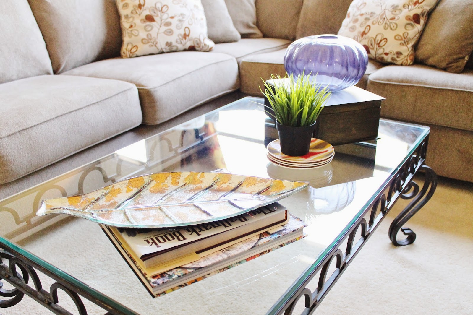
our living room. Frames were still picture-less, pillows were piled a mile high, and the coffee table needed to be cleaned,
badly.
Even though we are not done with the living room, I figured I would show you the whole room.
My main focus in this room is using different textures and warm colors. When you are married to my husband, you have to be careful of not getting
too modern with your designs. I want our home to feel cozy, yet not too dark and mature.
Let's start off with the red wall and deer mounts. Lord help me, what was I thinking when I suggested we hang those things in the living room? You have to understand that I grew up with dead animals hung on walls.
But, I also lived
way out in the country. I feel like we could pull off this look if we weren't smack dab in the middle of suburbia. Our six year old neighbor comes over all the time and always asks why Mr. Chris killed so many reindeer. We are surrounded by city folks and the deer need to come down, period.
Now for the red color. I love that the previous owners picked out this color, but I am a little tired of it. I am thinking the deer heads come down and this wall become the same color as its neighboring walls. As for what I will put up in place of the deer? I'm not sure yet. All I know is that Rudolph and his buds have got to go.
Moving around the room, here is an updated look at
y'alls favorite wall so far. Thanks to all of your love for this wall of ours, this space has been pinned almost
6,000 times on Pinterest! Now at least there are pictures in the frames. And for those asking, the table sofa table can be found
here. We bought it at Ashley Furniture, but it is no longer available there. As for the couch, we also got the at Ashley's and you can find it
here.
Keeping the tour going, our mantel is something we get compliments on all the time and, to be honest, this is how it has looked since the day we moved in; give or take a few items. The mirror adds light to the room while its sunburst design adds a modern touch. Our wedding picture is a
custom metal print from Tiny Prints. Its sleek, frameless design is so modern, but the colors in the picture add warmth to the mantel. The candlesticks are a classic touch and a touch of greenery is always a necessity. I love how the whole mantel resembles us as a couple.
Some things we are looking to change:
- The coffee table. Glass is not our friend, nor is it safe.
- The floors. Carpet and dogs don't mix. We are in the process of looking for new floors.
- Buy a rug when we get new floors.
- New curtains. I love ours, but we really want to go a little lighter with the color palette.
- Throw pillows. The ones the couch came with are awful, but so comfortable. When I have the time I am on the hunt for new covers.
- Reface the fireplace. The 90's called and they want their tile back.
I can't wait to keep y'all up to speed with how the progress is going. Slowly but surely we are turning this house into a home!


CUTE!! I'm loving that couch! We want a sectional soooo bad!
ReplyDeleteLooking good! I'm still LOVING that console table and gallery wall :)
ReplyDeleteLooks great!!
ReplyDeleteI love your mantle!
ReplyDeleteIt looks sooo good!
ReplyDeleteI love this living room! You have made such thoughtful decisions with the details!
ReplyDeleteThanks for the nice blog. It was very useful for me. I'm happy I found this blog. Thank you for sharing with us,I too always learn something new from your post.
ReplyDeleteChandeliers